Last Halloween, I decided it was about time I made some sort of miniature diorama to put on display for visiting Trick or Treaters. I didn't have time to do it then but I've been busy with the project over the last couple of weeks and will definitely be ready for Halloween this year.
Naturally, it being Halloween, I had some sort of ghoulish scene in mind but I found I couldn't get excited about that. It just didn't feel like me.
Then I spotted some very cute kits for little felt Halloween mouse children on Etsy. I ordered the kits and my mum made them up - I hate sewing but my mum loves it.
She did a brilliant job. Instead of a ghoulish scene, I decided I would make a mouse kitchen in which to display the two mouse children preparing to go out Trick or Treating. This felt much more up my street.
Nothing much happened for several months - only a bit of plotting and planning - and then in June I found the perfect glass-fronted room box at York Dolls' House Fair.
It was very cheap and had previously been used to display a butcher's shop diorama, so I started by stripping off all of the papers both inside and out.
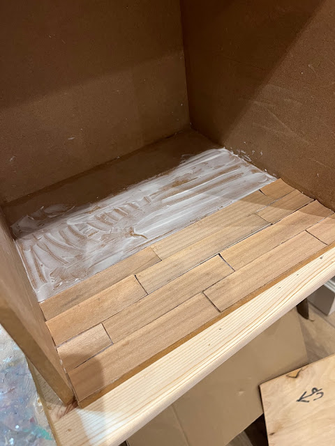
The plan is to only use things in my large and varied 'stash' for this project, and luckily I had a bag of wood veneers, one of which I used to make floorboards for the kitchen. I cut out strips and used wood glue to stick them down.
To get the 'floorboards' to dry flat, I laid a flat piece of wood on top and stacked a load of tins from the pantry on top of it to weigh it down.
It worked well. Next I painted the floor with a dark oak wood stain, making sure that plenty of the stain went into the cracks to emphasise the gaps between the boards: as this is a mouse house in an imaginary hole in the ground, I want it to be a little on the rough and ready side.
And finally, I gave the floor a coat of Humbrol Matt Cote (my favourite matt varnish for miniatures) and a light sanding to age it a little once it was dry. I'm very happy with the rustic finish.
Next up was the ceiling. To create an underground feel, I shaped some 3D 'roots' from brown paper soaked in wallpaper paste. These took an age to dry but that at least gave me an opportunity to get on with some of the furnishings.
I didn't really know where I was going with the furniture but decided just to crack on and see where it took me.
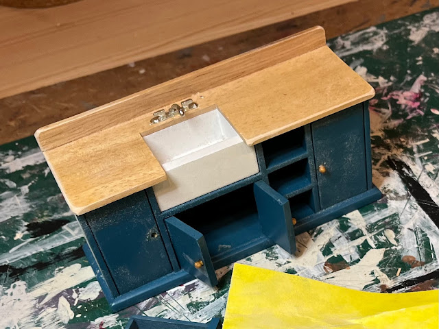
I started with a fairly modern sink unit I had in my stash. Initially I was just going to rough it up with some sandpaper but I was soon pulling off taps and doors and generally getting stuck in with a full refurb!
This is it with three of the cupboard doors removed, taps gone, lines etched into the draining board and doors, and distressed all over. I liked the colour so that stayed.
And this is it all finished. I initially had a strip of 'Delft tiles' long the back but then I decided that a mouse house should be more colourful (don't ask me why!) and I was much happier once they were replaced with this strip of sticky tape.
This first piece set the colour scheme for the whole room.
Oh and I added a little plug hole since there was nowhere for the water to drain out!
My next victim was another modern piece. I removed the vinyl coverings from the shelves and sanded the life out of the rest of it.
I decided to use the colourful sticky tape as a theme running through the different pieces of furniture, so I covered the shelves of this piece with it. The paintwork fitted with the newly decided scheme so I didn't change that.
Though in the end I did paint the drawers red (and replaced the knobs with fancy beads) to tie it in more with the next two pieces of furniture.
This was a nicely made dark brown dresser but it had a strange plastic feel to its finish which I'd never liked. I sprayed it with grey Rustoleum Surface Primer and then used acrylic paint in this nice deep red colour to tie in with the red in the coloured tape on the other two pieces.
It then got a coat of Humbrol Matt Cote and a good sanding to give it a distressed look. I was going to add some of the colourful sticky tape but the decided that it might be a bit too much if everything was overly coordinated.
I did, however, add a strip to this piece which was green until I painted over that with the same deep red acrylic paint used for the dresser.
Back in the room box the 'roots' had at last dried out. I gave the walls a coat of white acrylic paint. I had intended to give them two coats but then I decided that I liked the rougher effect of the single coat.
I painted the 'earth' ceiling dark brown but decided it was too dark. So I lightened it and made the 'roots' dark brown instead.
Next I dirtied the tops of the walls up a bit. I figured that there'd be a bit of damp in the corners away from the warmth of the room and a few cracks here and there.
I also added a supporting beam to prevent landslides! It's actually made from a piece of kindling from our log basket, sanded and stained dark oak.
You can see from this photo of the upside-down room that I have attached the furniture to the walls. I'll be carrying the room up and down two flights of stairs on Halloween (maybe for many years to come, who knows!) so I don't want everything sliding around in it.
You can also see that I've added a strip of battery operated LED lights to the top front edge. They are warm white and shine just the right level of light into the room whilst being hidden behind the wooden frame of the glass front. The lights have a self-adhesive strip but I was worried it wouldn't adhere to the painted surface properly so I painted a coat of Humbrol Matt Cote where they were would go and stuck them to that when it was dry. They seem pretty secure.
I cut a little grove into the corner of the box for the wire and will attach the little battery box to he top of the room box with double-sided sticky tape.
Every kitchen needs a stove and I had this lovely heavy cast iron one in my stash and it was just the right size. The flue, the shelf, and the fancy bits (vintage shelf trim and buttons) just sort of evolved as I tried to tie this corner in with the colour scheme for the rest of the room.
And here it is starting to come together. I added more shelves to the room in the form of an old dark brown wooden shelf unit which I stuck to the wall upside-down. I didn't want all of the furniture to be painted but have a concern that this looks too dark, however, I've stuck with it because I know it will look lighter (and hopefully less like an upside-down shelf unit!) once filled with bits and pieces.
Other additions are: a little cupboard made using the two doors I removed from the sink unit, a little table (vintage Pit-a-Pat) and two chairs which were green before I gave them a good sanding.
So, that's it so far. I'm thoroughly enjoying the freedom to do what I like with this project and it's so long since I did anything like this that I'm quite relieved to see it coming together.
Next step is to add all of the bits and pieces which bring a scene to life. I want it to be a warm, welcoming, homely and quite cluttered little kitchen. We'll see how that goes in Part Two!
Until next time,
Zoe


How gorgeous is this!? What a wonderful little project. Jenny xx
ReplyDeleteThanks, Jenny! xx
DeleteOh this is just gorgeous Zoe! I love the way your head is following your hands/instinct. You make me want to copy you 😏 And I am really looking forward to seeing the finished room 😊 I much prefer your approach to anything horror-focussed. Edel x
ReplyDeleteThanks, Edel! xx
DeleteWonderful. Love the hacking about and modifications - go wild! Adore the dragon costume your Mum stitched, made me smile big-time
ReplyDeleteThank you! I will pass your lovely comment on to my mum! (P.S. It would be lovely to know who you are! x)
Delete'Tis I - the mysterious Do (theinfill). Apologies for not being awake enough to work out how to put in an URL :)
DeleteThe mice are adorable - congratulations to your mother! Butterfly and I share your sewing aversion.....
ReplyDeleteI just love the way the colours have worked so well, taken from the tape-inspiration. The sink is particularly brilliant.
Much looking forward to part two.
xx
Thank you, Cestina! It’s almost finished now, so part two won’t be too long. xx
Delete